


Case study
Yuru
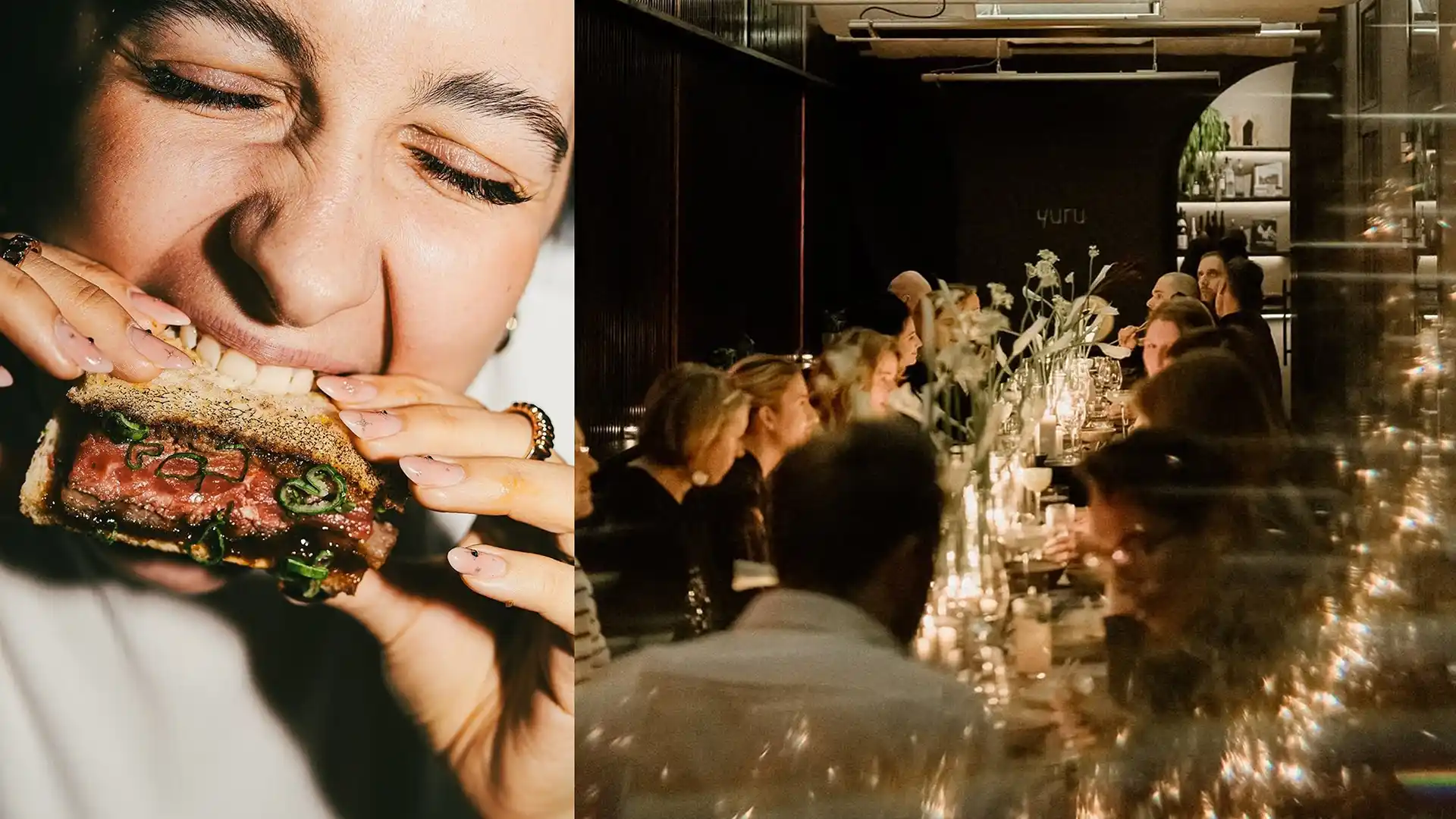
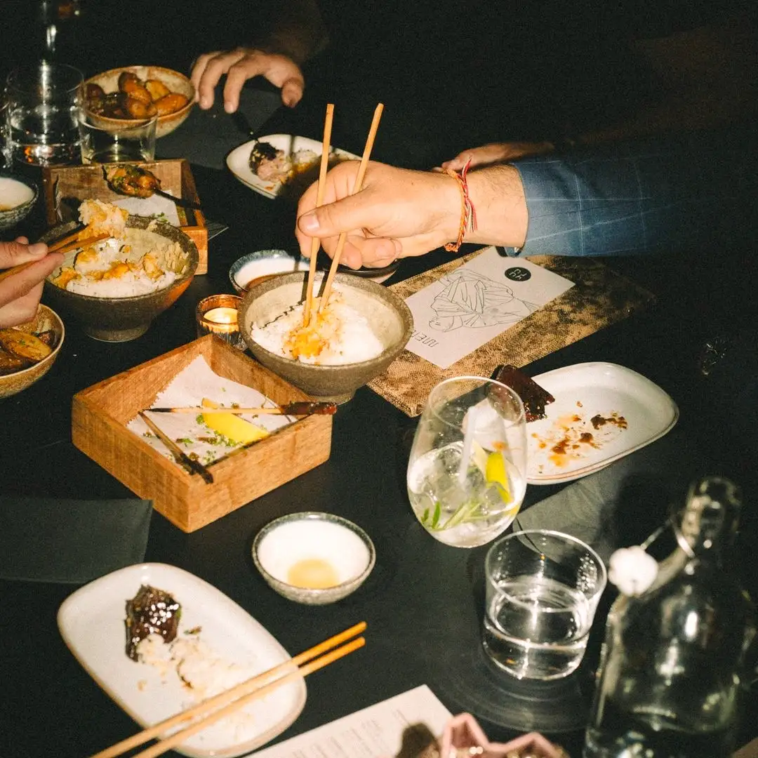
YURU is an intimate, high-end sushi bar and speakeasy restaurant in Ötkert, conceived as the small sister of DOJO, located right next door. While DOJO operates as a Japanese boutique club with a strong focus on drinks and nightlife, YURU was created as a quieter setting for conversation-driven dinners. A small, secluded space where food, atmosphere and time move at a slower pace.
The concept is built on the intersection of Tokyo’s underground nightlife and Danish minimalism. Clean, yet layered. Restrained, yet distinctive. The kitchen follows a similar approach, combining traditional Japanese techniques with a contemporary, boundary-pushing attitude and a strong visual and sensory presence.
One of the main challenges was establishing a clear, independent identity for YURU. Creating intimacy and developing a visual language that could feel both subtle and provocative were key considerations from the start. The collaboration was smooth throughout the process, with a high level of trust and creative freedom on both sides.
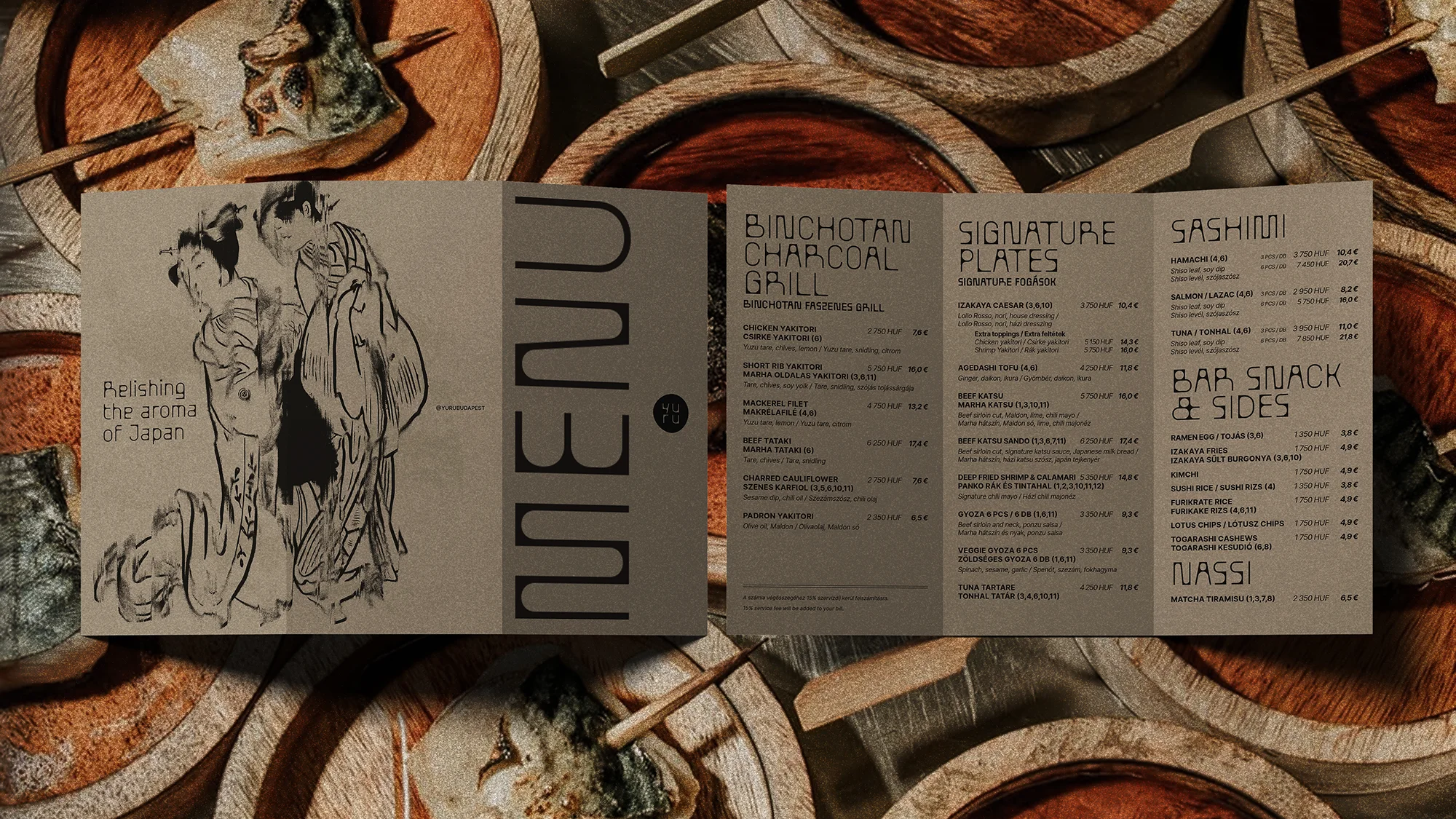
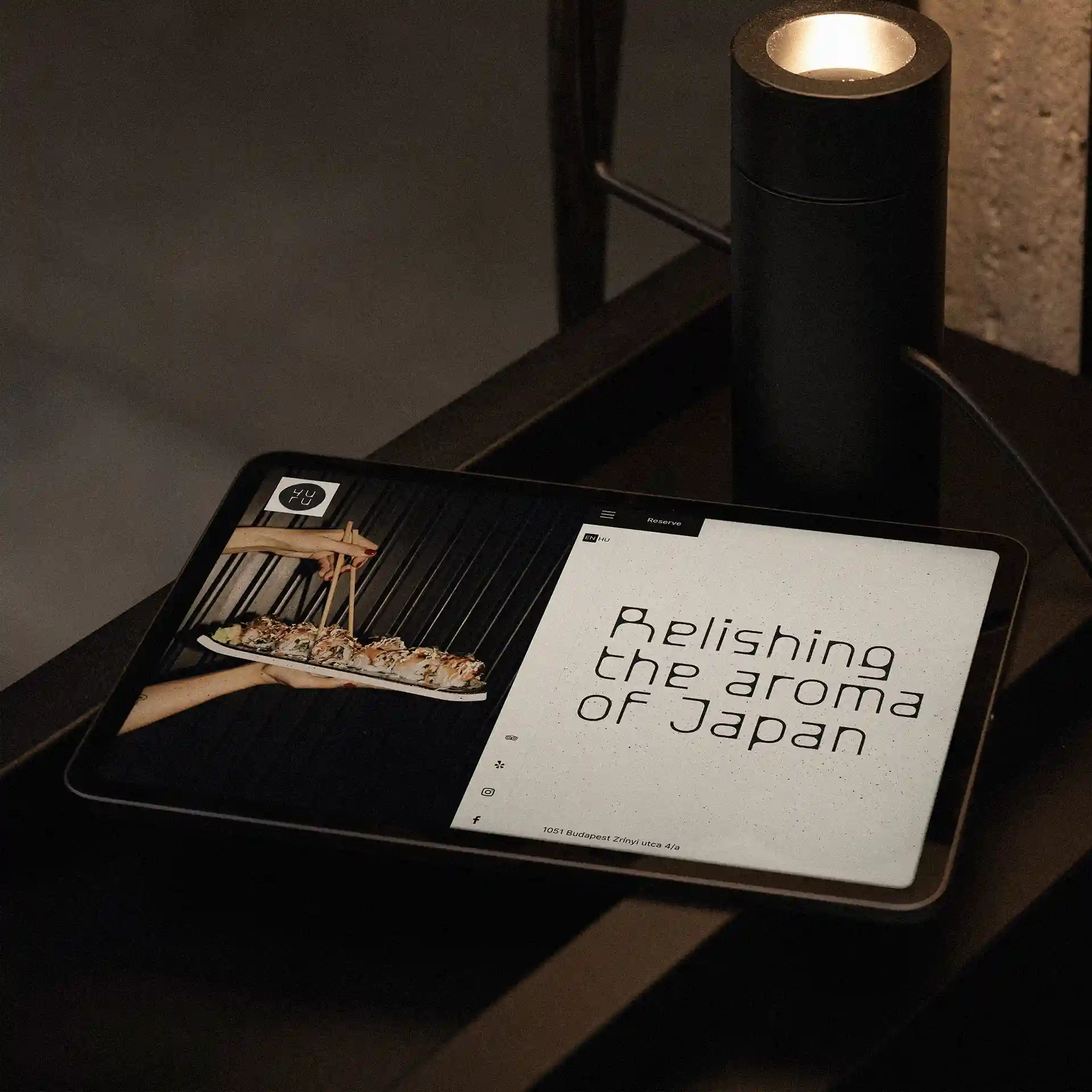
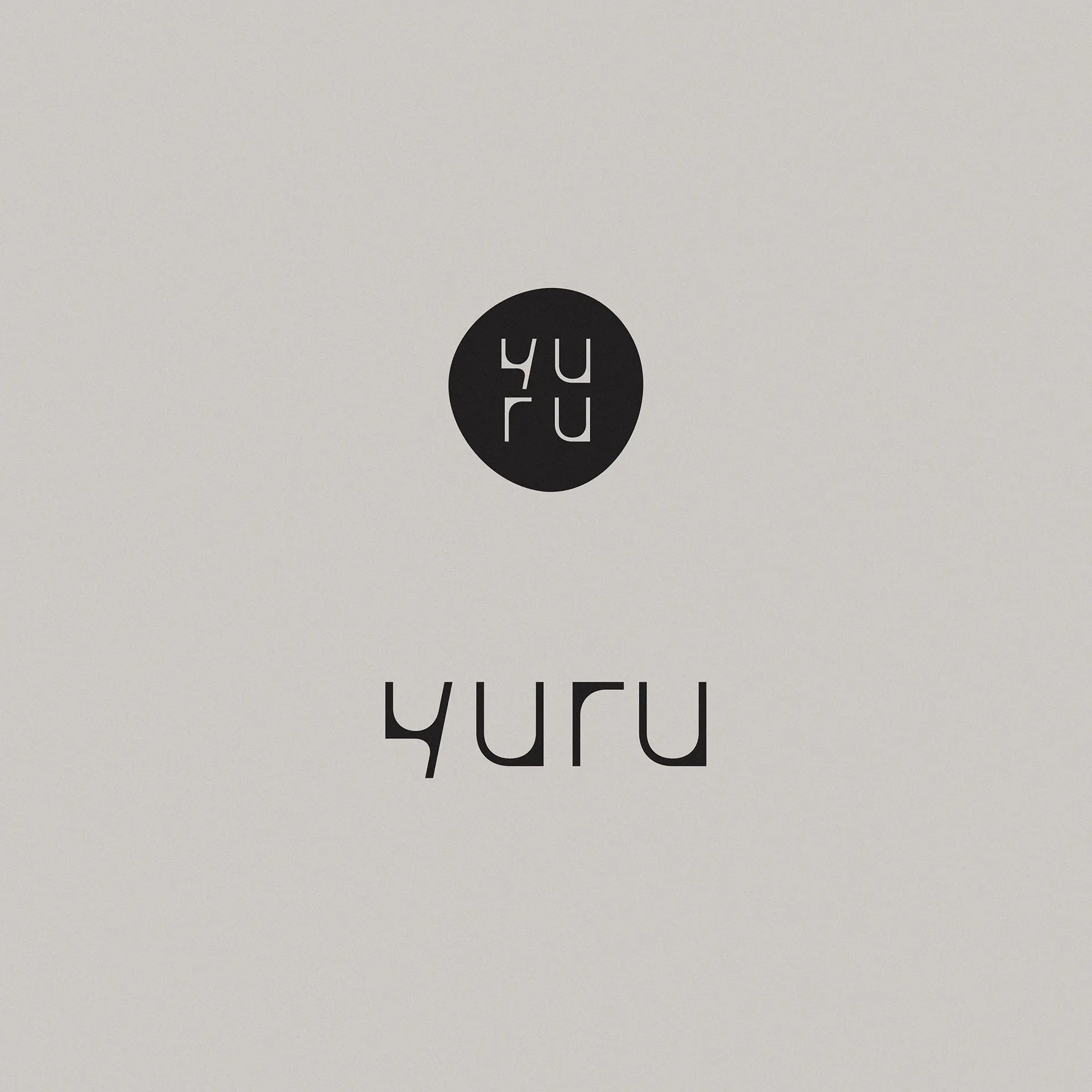
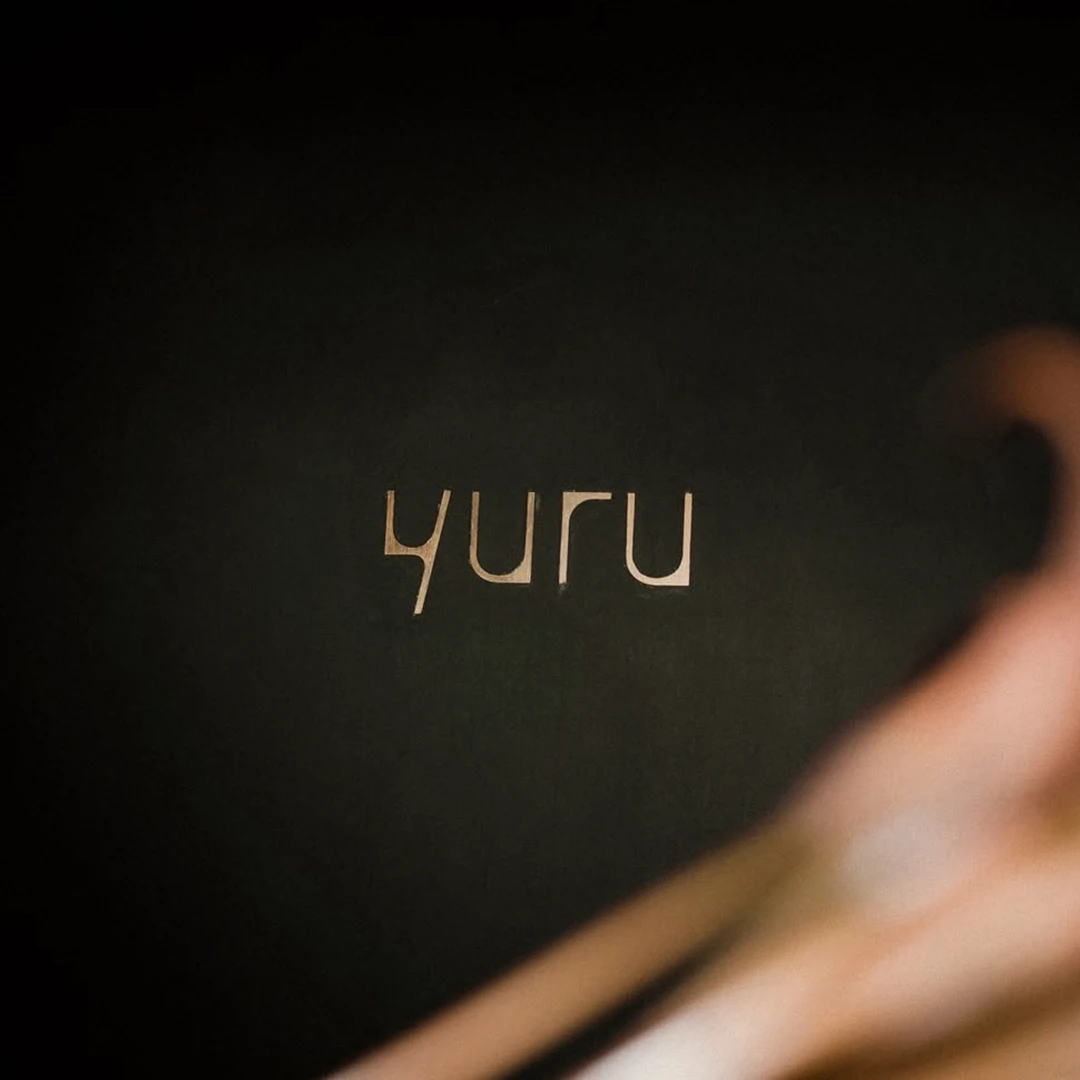
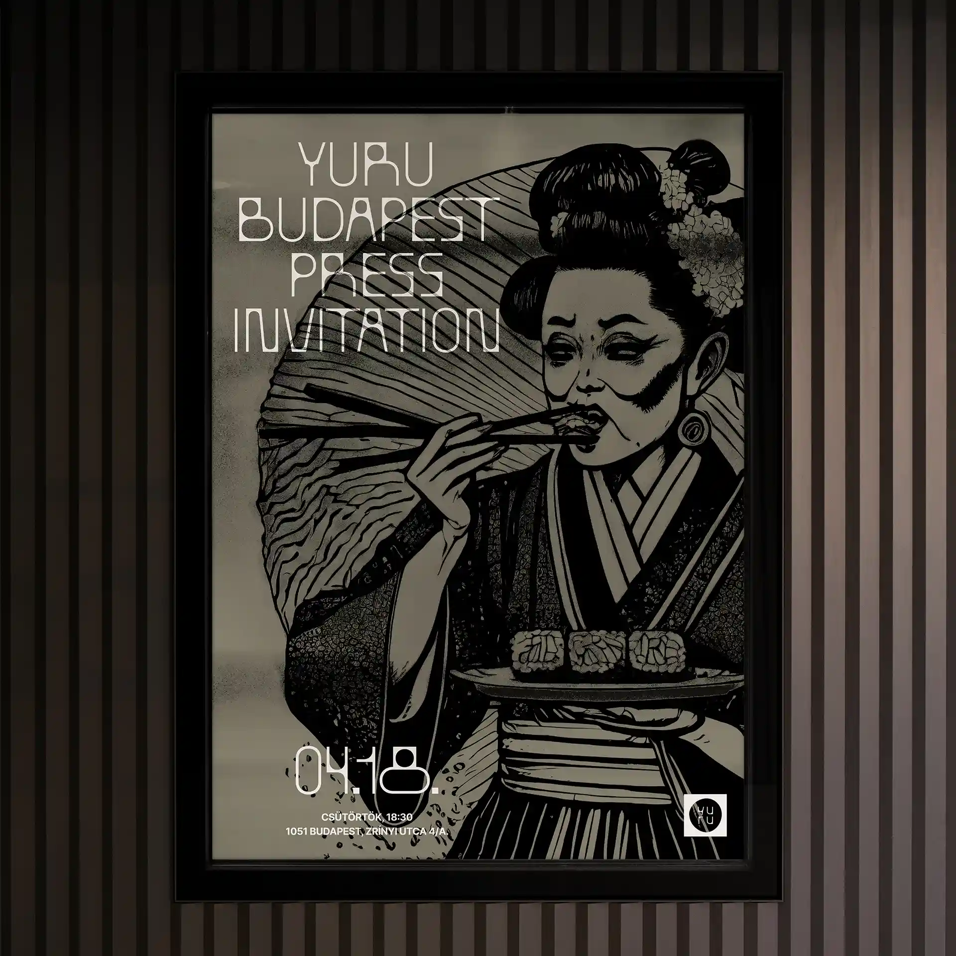
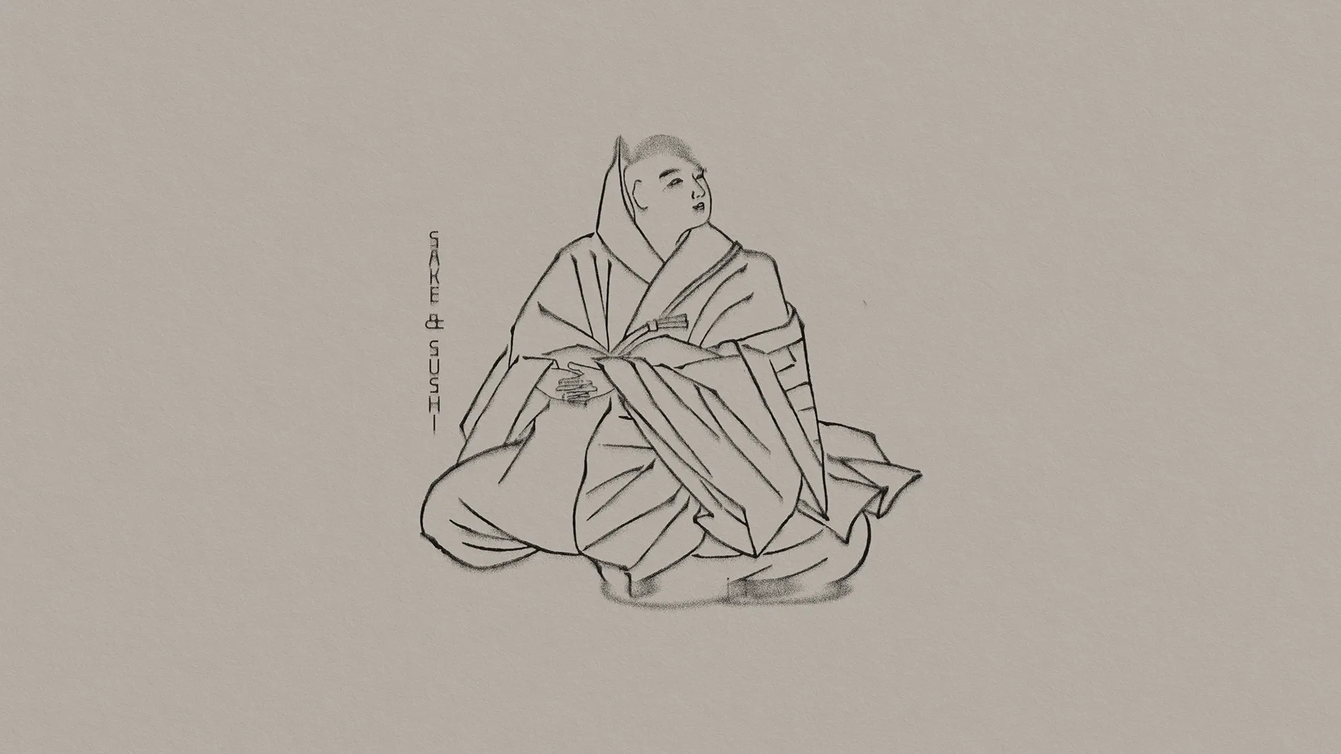
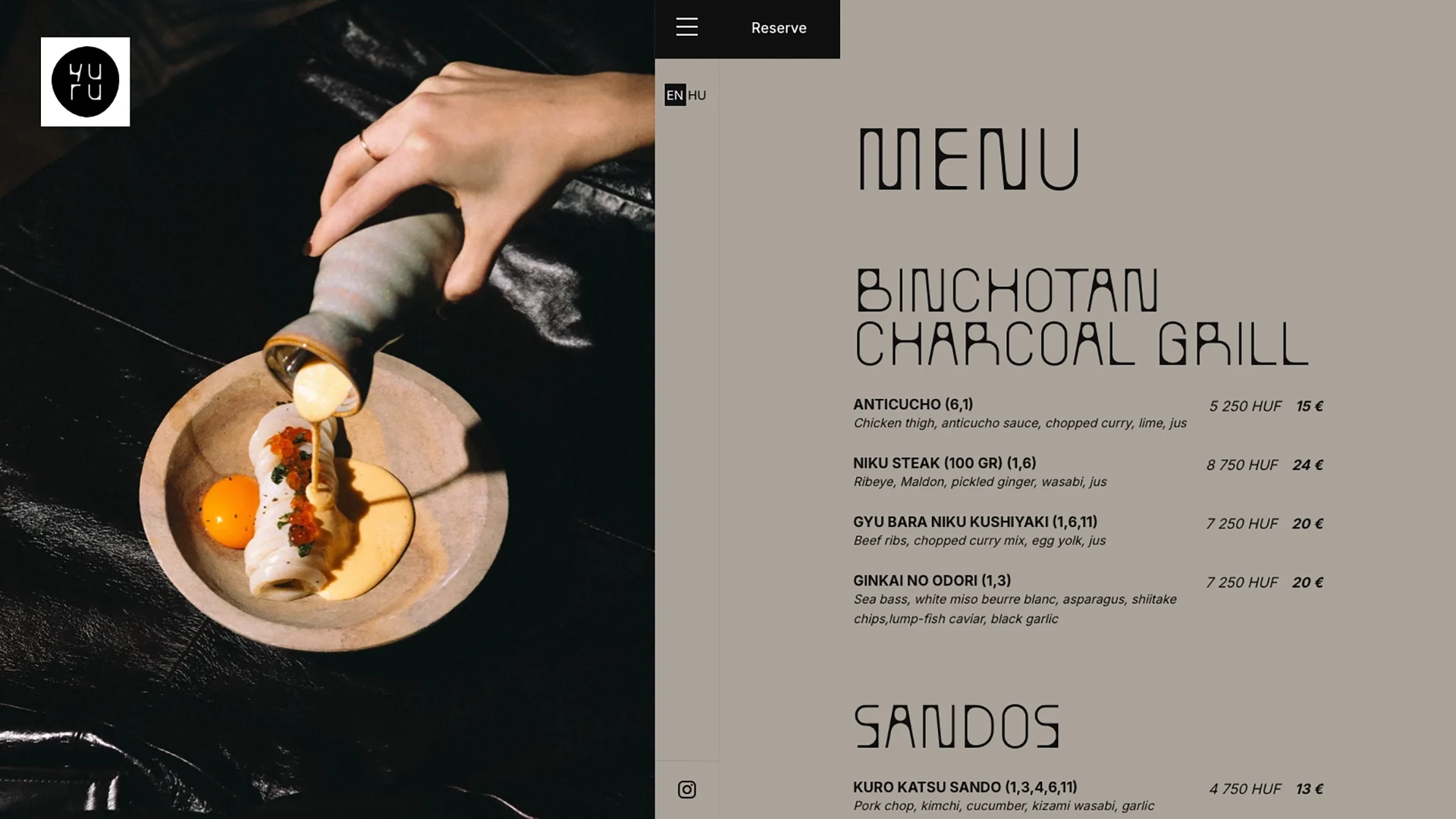
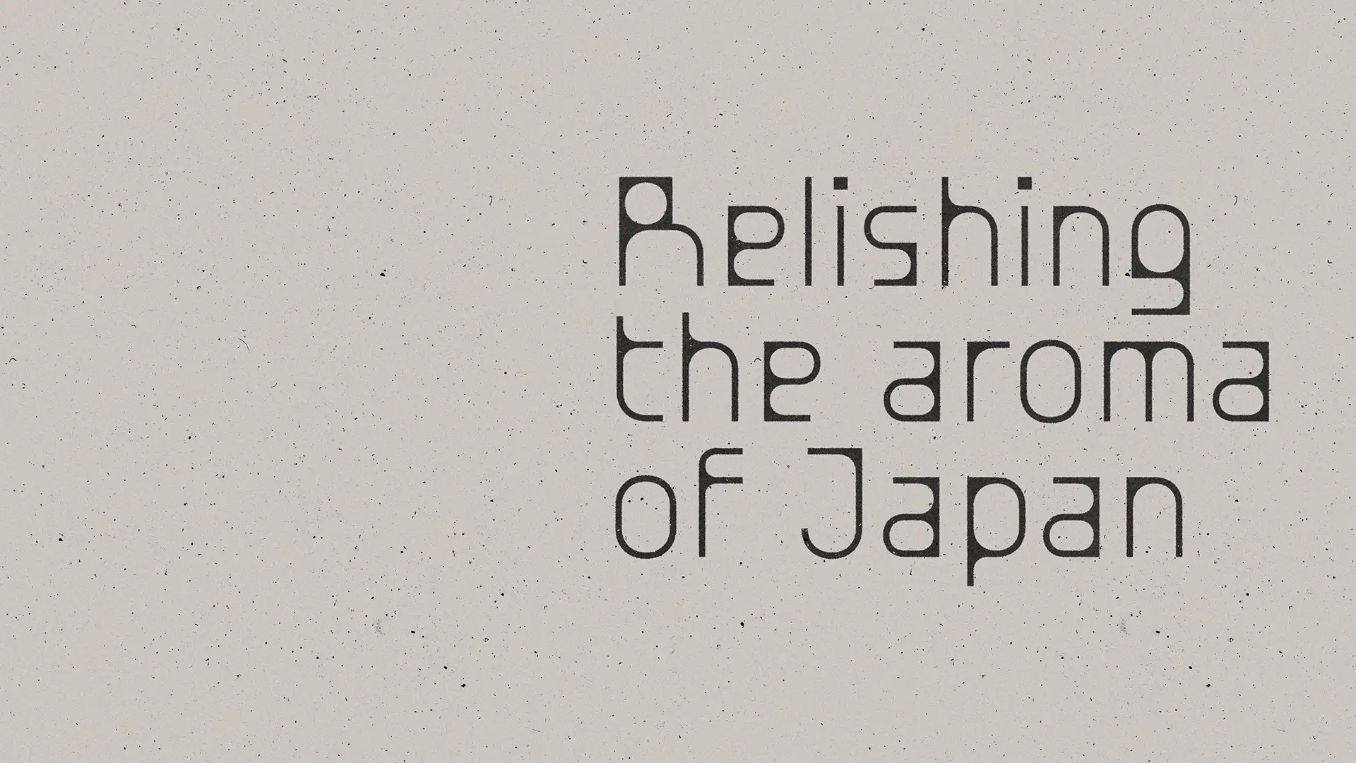
The foundation of YURU’s visual identity is a strong, distinctive typographic system. The chosen typeface reflects both Japanese linework and Scandinavian minimalism in equal measure, without relying on familiar or stereotypical references. Typography does not function as a supporting element, but as one of the core pillars of the identity, carrying much of its recognisability on its own.
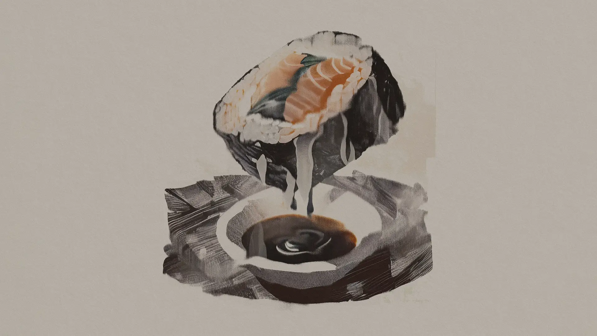
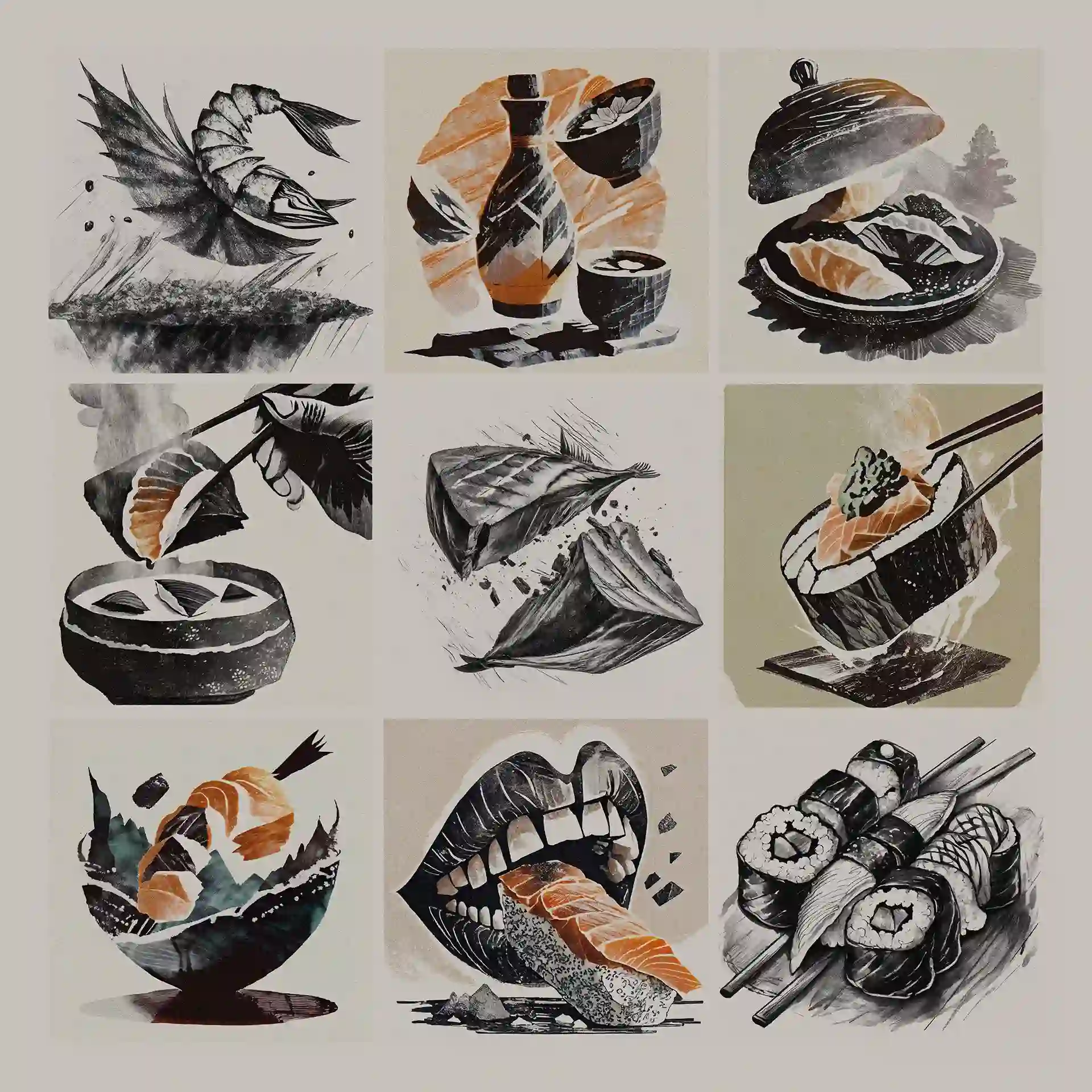
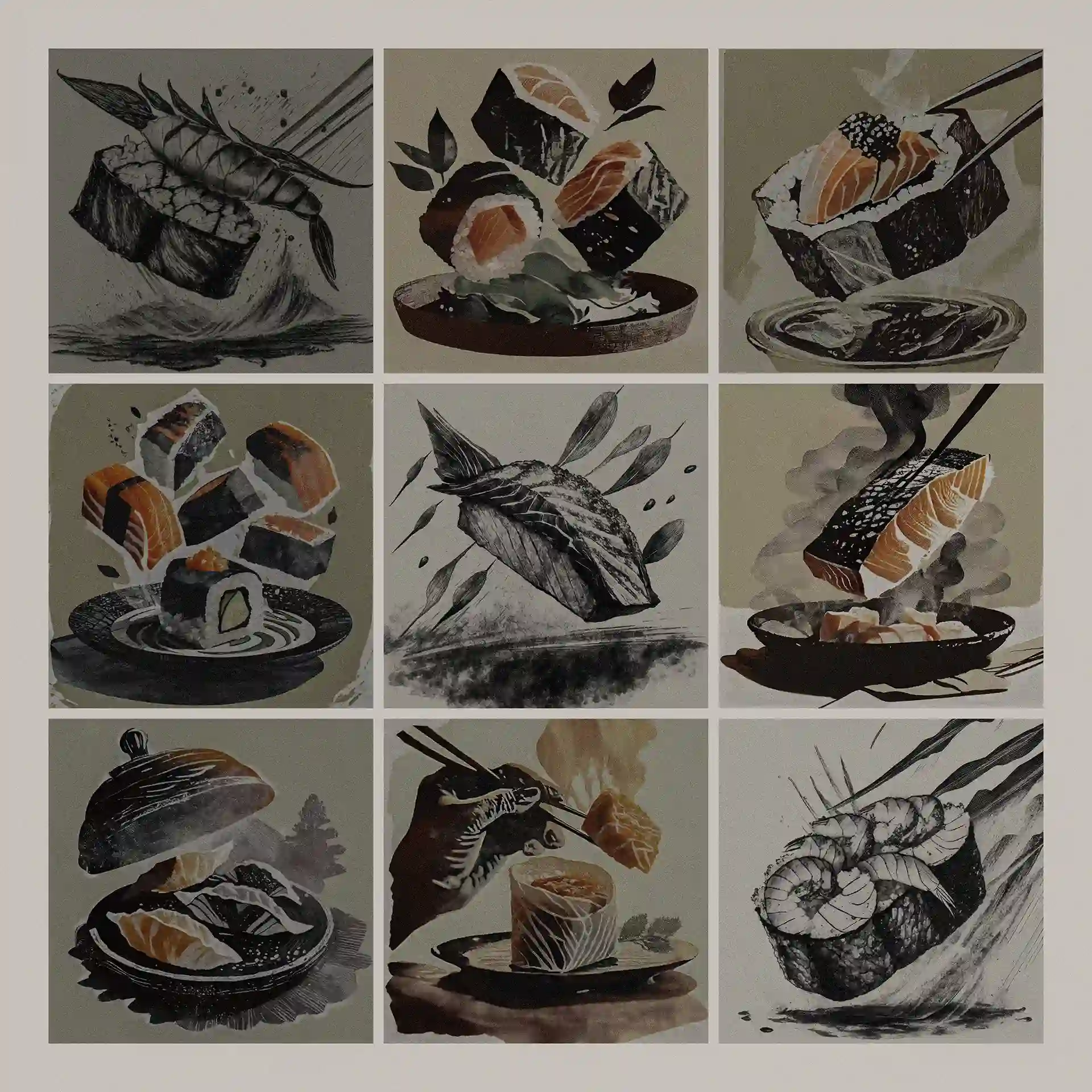
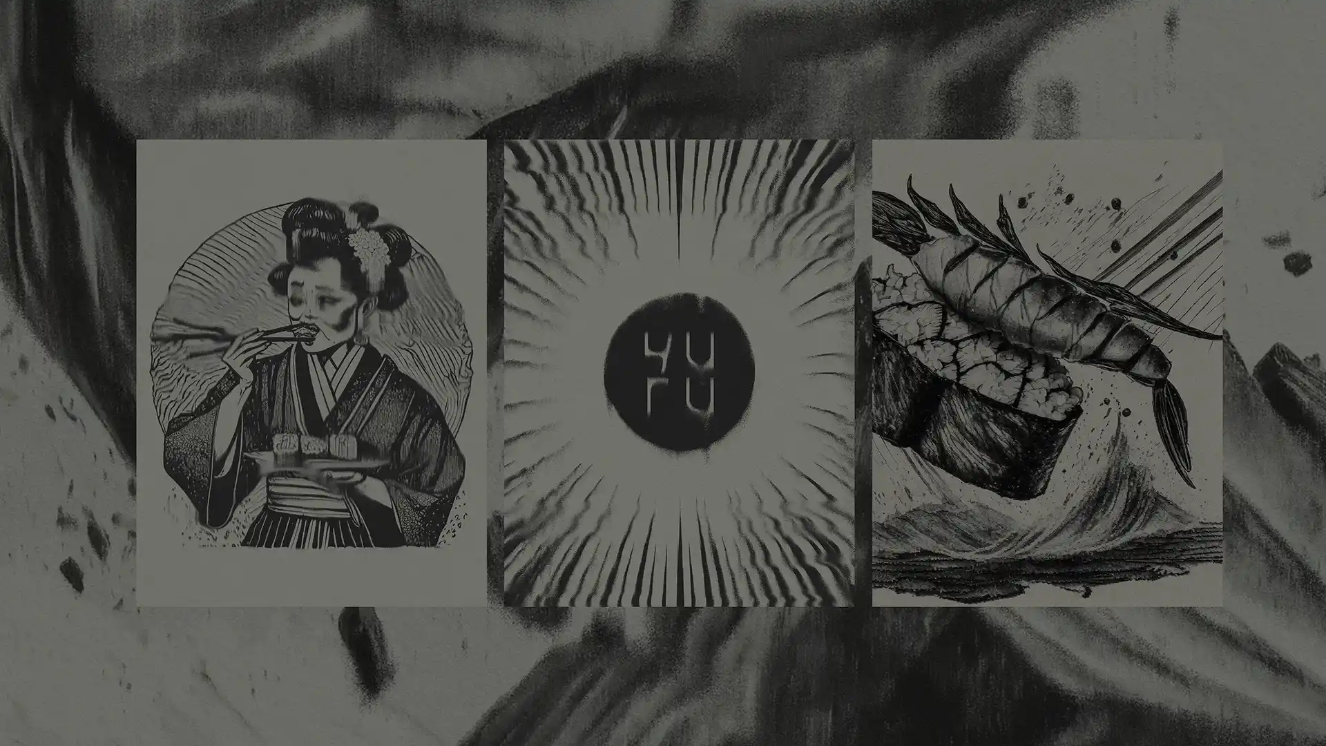
The second defining visual element is the custom illustration system developed for YURU. These illustrations are dynamic, raw and deliberately imperfect. Charcoal-like textures, distorted forms and collage-inspired compositions create a sense of movement and tension. Rather than serving as decoration, the illustrations actively shape the visual communication and reinforce the overall atmosphere.
When defining the relationship between YURU and DOJO, the focus was placed less on aligning with DOJO’s graphic identity (designed by Papay Fanni) and more on responding to its interior spaces. Materials, dark tonalities and the intimate spatial experience provided stronger points of reference than any visual branding elements.
The result is a layered yet controlled graphic system that supports the experience without overpowering it. The identity does not seek to explain itself. It stays present, allowing YURU to unfold in its own quiet rhythm.
Project Management: Mihály Szöllősi
Art direction: Kata Baumgartner
Art direction: Fanni Zámbó
Visual identity: Fanni Zámbó
Web development: István Zámbó
Interior design: NOUMEN STUDIO

